SpotOn, a provider of mobile payment technology, was looking for premium packaging for their newly branded point-of-sale terminals. McIntire Design designed and developed this carton to work with SpotOn’s current packaging system and to provide the consumer with an elevated unboxing experience.
Designed while part of Clorox’s design group
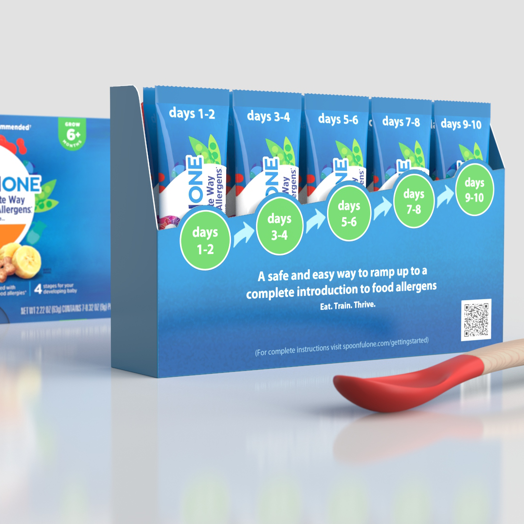
SpoonfulOne’s supplement provides micro amounts of food allergens to help infants grow up to be food allergy free. This system is an intro to SpoonfulOne’s full spectrum product. We designed this packaging to live on the kitchen counter and communicate product usage in a clear and friendly manner.
Arta, a newcomer to the tequila industry, needed help getting noticed in the increasingly busy tequila section. The surge in popularity of tequila in the last few years has made it all too easy for a new player in the market to be just another face in the crowd. The clean lines, modern shape, and unique neck finish that we created for the Arta bottle, makes it a standout in the category. The triangular footprint of the bottle carries through to the neck and cap of the bottle and provides a large canvas for the vibrant label.
Designed for and in collaboration with Paul Bennett while co-founder at Solid Design
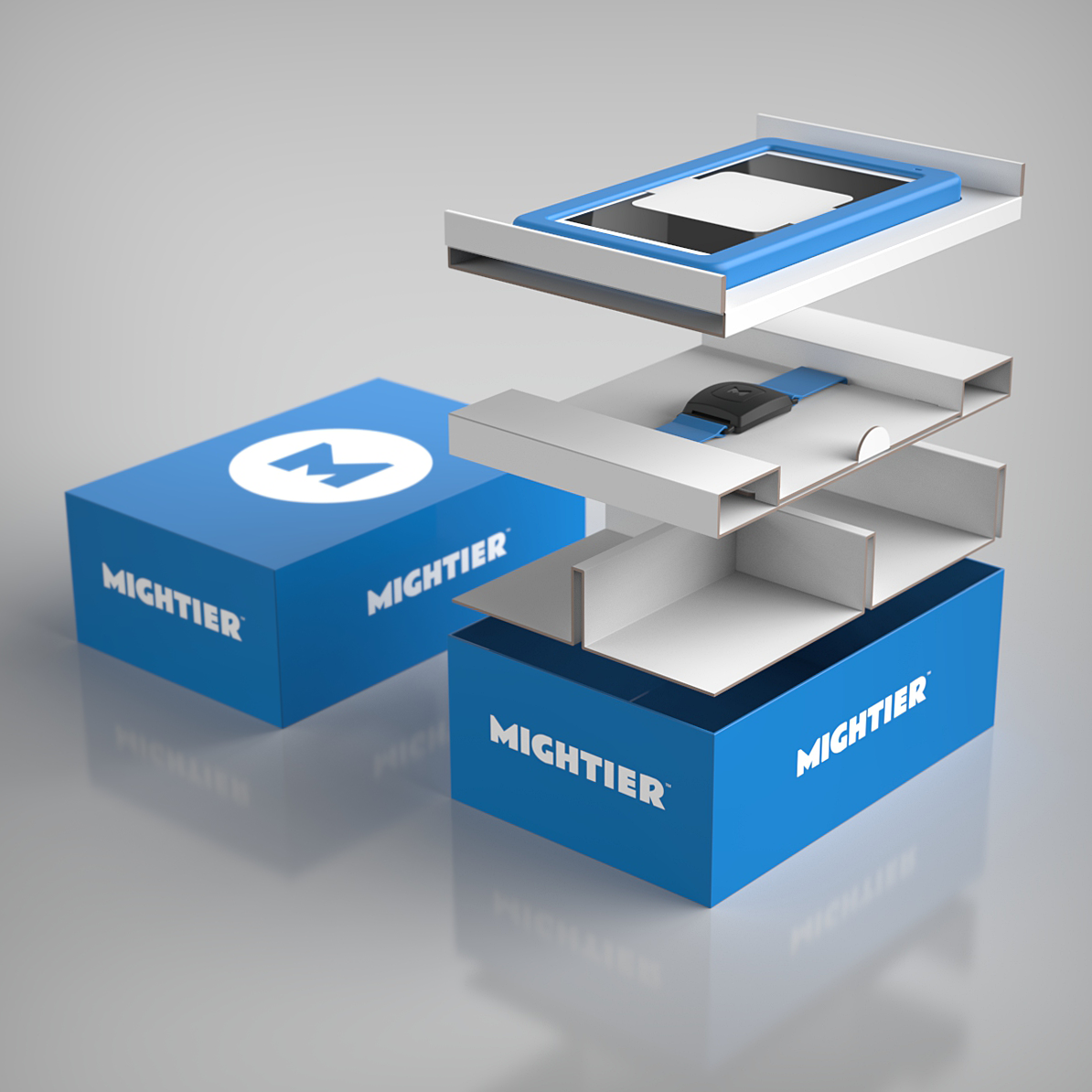
Mightier uses the power of play to help kids build emotional strength. Their packaging needed to be flexible as the components often changed. With this design, we created a clean unboxing experience and a modular system that adjusted to the varied package contents. Co-designed with Alex Coriano
On-the-go water filtering has become Brita’s fastest growing segment. Building on the success of the 1st and 2nd generation OTG bottles (that we designed), the 3rd generation bottle utilizes clear plastic that better shows the water level. A flip-top spout recedes into the cap to help keep the mouthpiece clean and an integrated finger loop provides a secure means of carrying the bottle while eliminating the need for a separate finger loop as in the previous models.
This product launched in January 2013 and promises to be another hit for Brita’s on-the-go product offering.
Designed while part of Clorox’s design group
Brita is one of the leading companies in household water filtration. While previous Brita filtering pitchers have certainly fulfilled the need for great tasting water, they were hardly something consumers wanted to leave on their kitchen counter or dining table.
In designing their first premium water pitcher, the challenge was to maintain the functionality of the current pitchers yet create an object that would feel at home in a modern kitchen. We updated the pitcher with the use of stainless steel, strategically placing it on the pitcher to hide the filter yet show enough of the water so that the consumer knows when to refill. Soft-grip material on the inside of the pitcher handle provides a more comfortable pouring experience.
The Brita stainless steel pitcher launched in November 2012 to overwhelming shopper enthusiasm.
Designed while part of Clorox’s design group
So Delicious, a maker of dairy-free food and beverages just graduated from a gable top carton for their line of organic almond milk to a sleek, easy to grip bottle. Our objective was to create a counter worthy design that will look right at home in the modern kitchen. Keeping a square footprint for space efficiency, we rounded the design just enough to allow for a comfortable grip. Completing the design is a luxurious satin-finish full shrink label.
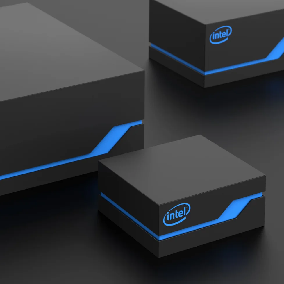
Intel’s launch of its wearable electronics line at CES (Consumer Electronics Show) required show-worthy packaging. The design we created, though simple, had a premium build, and scaled effectively to the different sized products. The cartons were finished with a soft-touch matte material.
Biotech company Pembient was founded on a vision of a world without wildlife poaching. Wildlife crime such as poaching is now the most urgent threat to some of the world’s best loved species, including rhinos. By generating synthetic rhino horn, Pembient aims to reduce the demand for the real product.
Pembient asked McIntire Design to develop a promotional bottle that would bring attention to this effort focused on diverting demand for the real horn. The bottle is inspired by the idea of a rhino horn transitioning into a scientifically pure version of the product. Working with actual scan data of a horn, we concealed the opening in the base resulting in a visually uninterrupted form. We were happy to be a small part of a cause we believe in and hope that Pembient succeeds in making a difference.
Heartfelt Creations, a producer of crafting supplies, needed packaging that would command attention, unify their product line, and alleviate customer confusion as to which packages contained dies and which packages contained stamps. Our solution (consisting of a clear plastic carton with a paperboard sleeve) allows easy identification of the product inside. In addition, the label demonstrates the results you can expect from using the kit.
Designed in collaboration with Perspective Branding
Tres Generaciones, a super-premium tequila, demanded a bottle that reflected the quality of the product. The design incorporates a thick glass base, hammered metal shoulder, and a wood bar-top closure, all adding to the heritage appeal of the Tres Generaciones brand. A deeply sculpted agave on the back of the bottle further supports the premium nature of the tequila.
Designed for Akimbo while co-founder at Solid Design
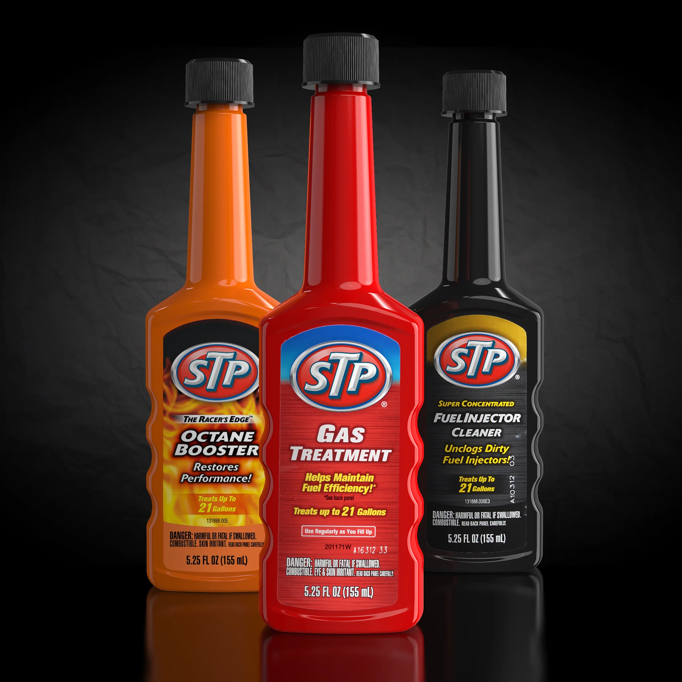
STP, one of the most trusted names in automotive care needed to invigorate the packaging for their line of fuel additive products. They also needed to address functional issues with their current bottles. We conducted consumer research which revealed ways we could improve the neck and shoulder of the bottle resulting in a more positive consumer experience. The new design extends to over 20 different STP products.
Designed while part of Clorox’s design group
Brita’s Grand pitcher has consistently been one of its best-selling pitchers. When it came time to create a new pitcher to meet store demands, Brita made the decision not to replace Grand but to update it.
Our challenge was to re-vitalize the look without making any physical changes to the pitcher itself to avoid tooling costs. The addition of this “U” shaped sleeve provides a punch of color and texture while framing a view of the water. The sleeve approach also allows Brita to easily change the look of the pitcher by introducing a variety of sleeve color and pattern options.
Grand remains one of Brita’s best-selling pitchers.
Designed while part of Clorox’s design group
Juice Mobile is a charging product from Bretford that turns a single wall outlet into a flexible charging solution. Our challenge was to create shipping packaging for their different product offerings consisting of a starter kit, power track, pods, and replacement parts. These structures needed to reflect the premium price point and present the products in an organized fashion.
Our solution for the intro kit (shown here), provided a simple un-boxing experience. The two heavy components, the charger, and the track, are separated by a durable platform which folds off of the inner carton eliminating the need for a separate piece. A lift system was developed to help users lift the heavier track from the base of the structure.